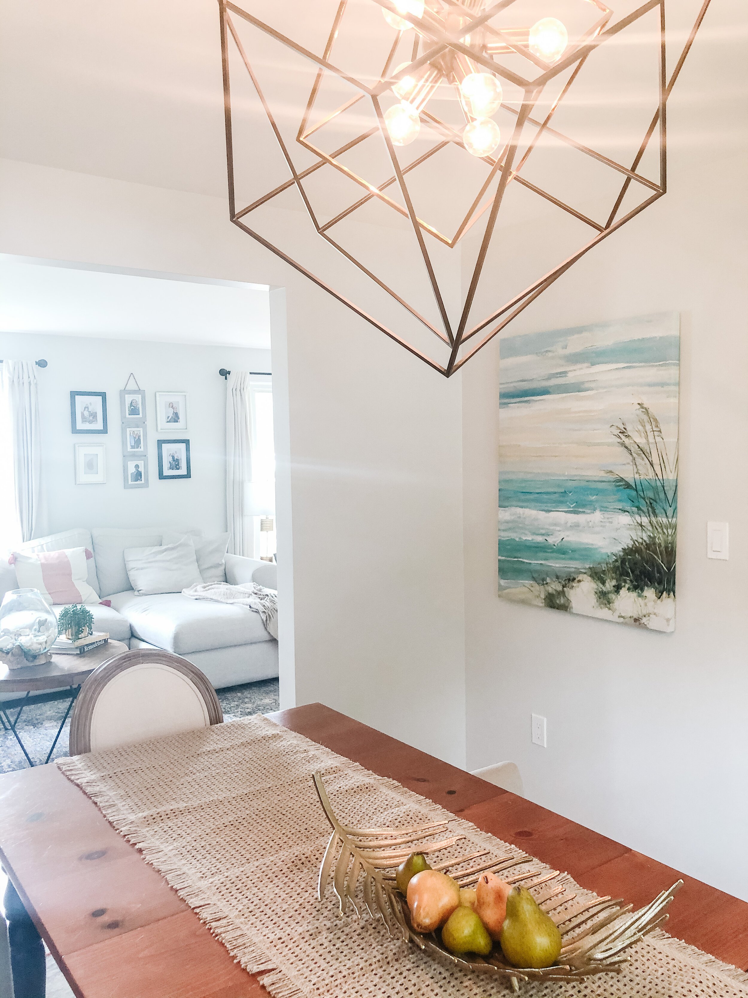
Is Your Space a Reno or Refresh?
Like the rest of the design industry and home decor retail sector, I have been SO incredibly busy with client projects. I have met some wonderful new people and transforming their spaces has been an honor.
With everyone spending more time at home, it has given us all an opportunity to assess our home layouts, functionality and make the most out of our space. And there’s something to be said for being in your home and really loving the look and design...because you know what? It makes you feel GOOD. And that’s important.
Is there a room in your home that needs some love? I thought I was done with my home, but after this past year, I too have the urge to do some design refreshing in certain areas.
I can’t tell you how many clients think they need to do a complete renovation and purchase all new furniture. But 9 times out of 10, after they schedule their “Love Where You Live” design consultation and I check out their situation...all they really need is a refresh.
My first step is always to try to repurpose what you already have, or give it a face lift. I also like to see if you have any vintage pieces (possibly passed down from family), because in my opinion - every room needs some vintage in it. It gives it soul.
I wanted to share with you my favorite room refresh project, and give you the details on what we did - and also share some before and after photos. I think you’ll be amazed.
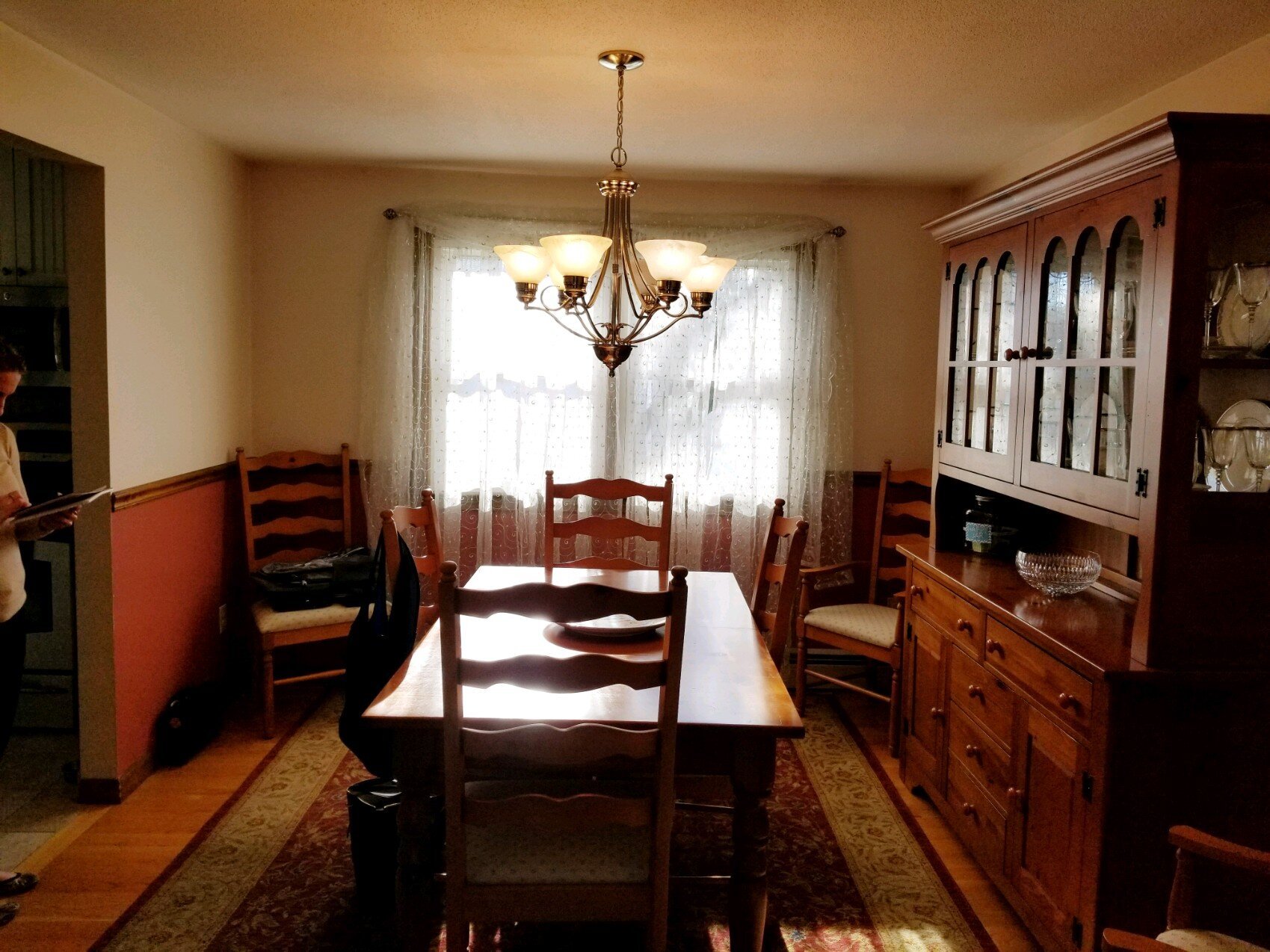
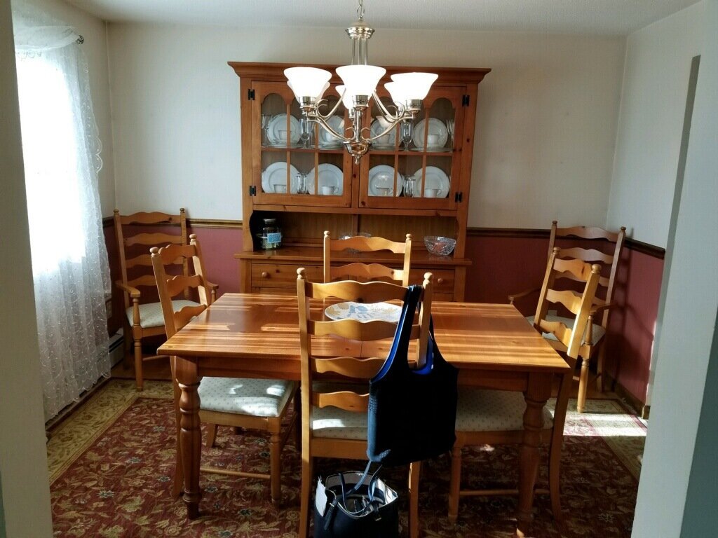
Below are some before photos I took at the first meeting. The client wanted a completely new dining room look in a bright, neutral palette. They were ready to get all new furniture, lighting, rug and decor - as well as paint.
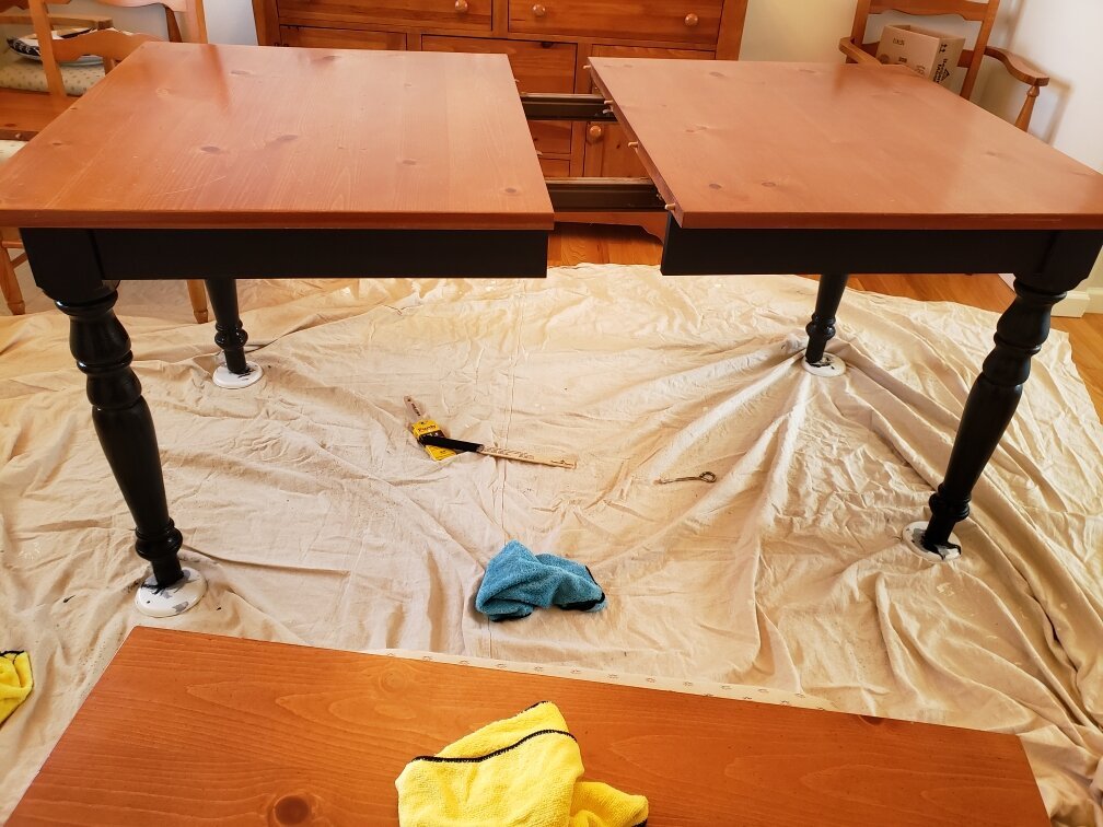
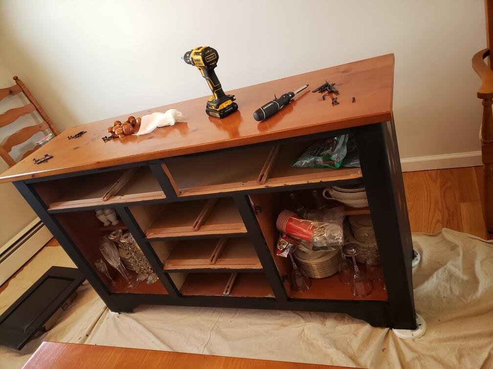
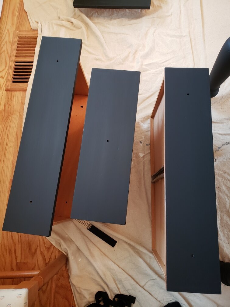
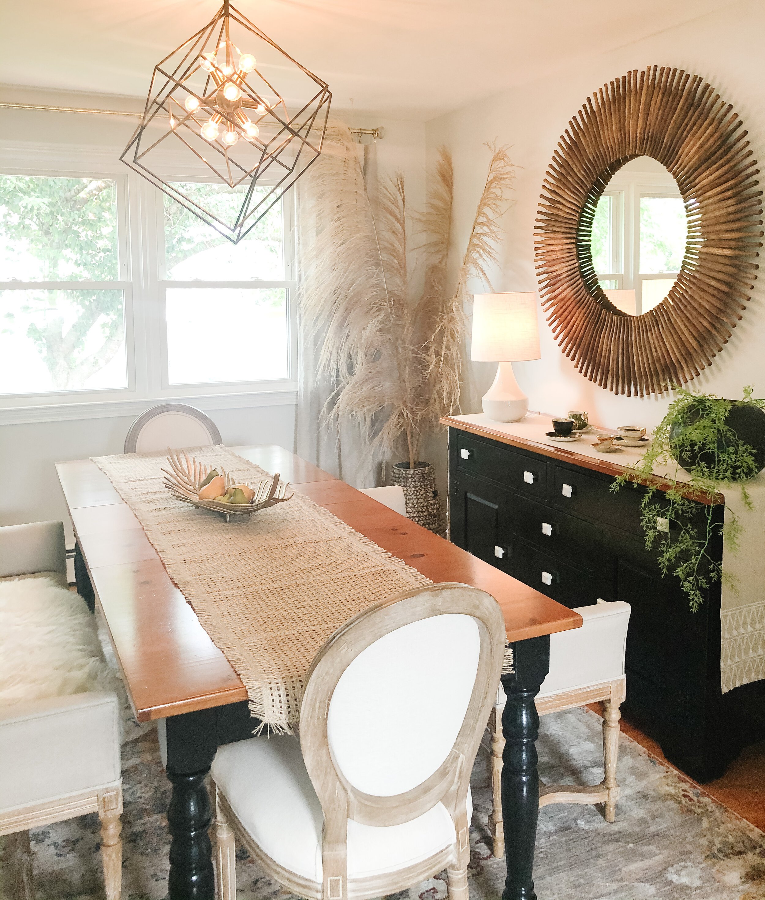
The dining table and bottom portion of the hutch were great, solid pieces of furniture, so I wanted to breathe some new life into them with some paint and new knobs. This would also be the largest chunk of the budget if we were to buy brand new, so by doing this it was preserving our budget for the chairs, etc.
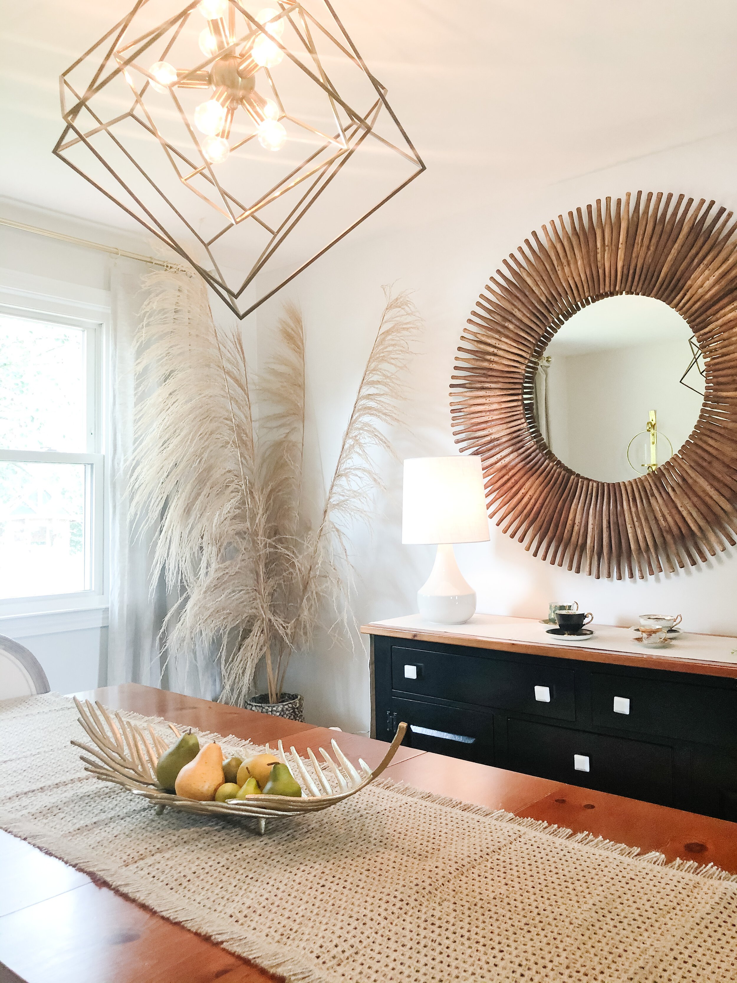
We removed the chair rail and painted the walls in one of my favorite white paints - Benjamin Moore Paper White. This paint hue is not characterized by its namesake. In fact it’s a very warm white with beautiful undertones.
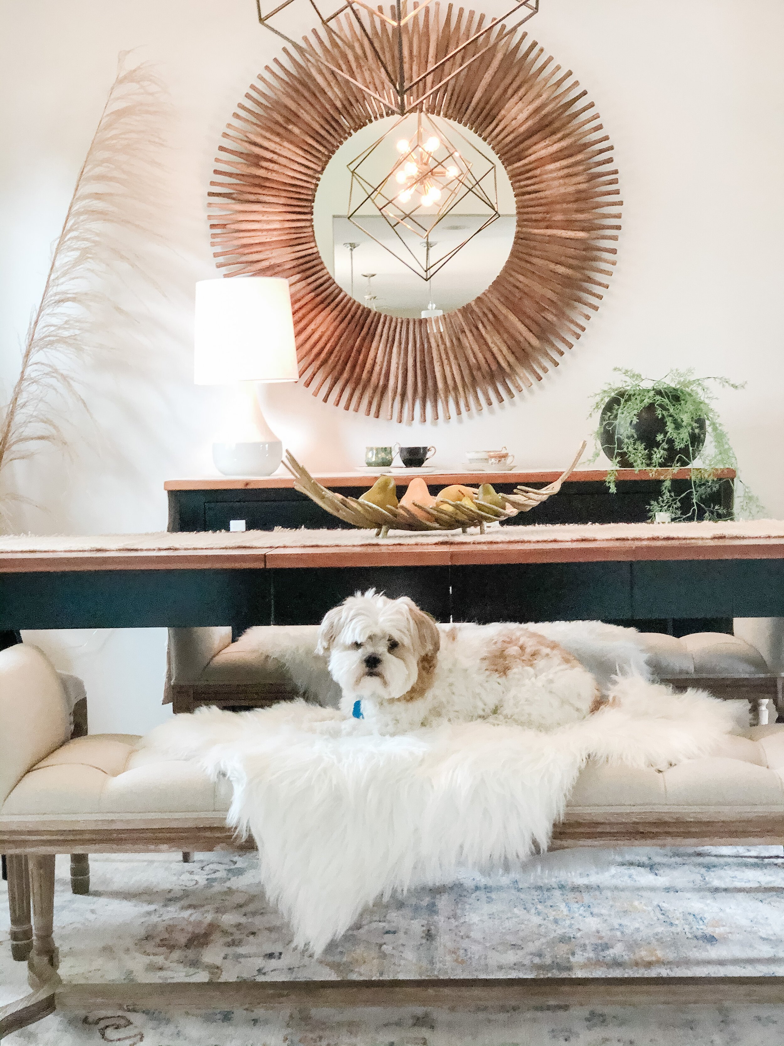
We added new seating, lighting, a very large mirror, pampas grass, simple curtain panels, and some abstract wall art. I used some of the client’s existing china for the hutch decor.
It was a quick and very fun design project - and the transformation was incredible! What the client thought was going to be a major overhaul was in fact, a simple refresh. Yay!
Are you asking yourself the same thing in a space in your own home? Is this a Reno or a Refresh? Well let’s connect and find out! I think you’d be surprised.

